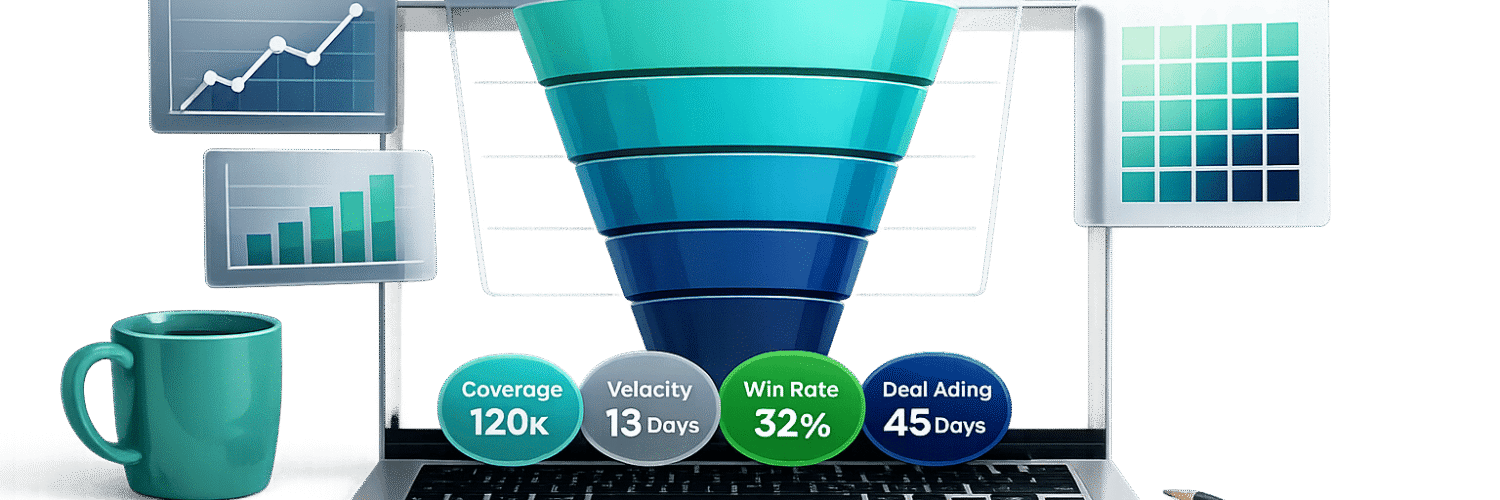
Your sales pipeline isn’t just a list of deals – it’s your revenue’s story. But without clear visuals, stalled deals and missed opportunities can go unnoticed. The right visualizations make it easier to spot bottlenecks, track deal progress, and improve forecast accuracy by up to 25%. Here’s what you need to know:
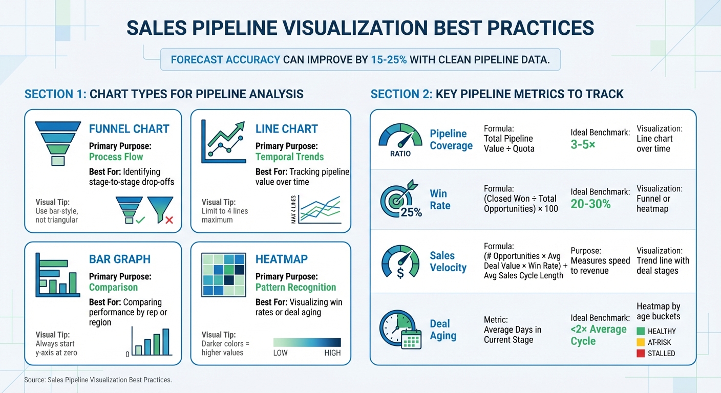
- Funnel charts: Show where deals drop off at each stage.
- Line charts: Highlight pipeline growth or decline over time.
- Bar graphs: Compare performance by sales reps or regions.
- Heatmaps: Identify win rates and deal delays with color-coded patterns.
Key metrics like pipeline coverage (3–5× your sales target), sales velocity, and deal aging help you stay on track. Clean data and consistent designs are essential for actionable insights. Teamgate helps sales teams follow a clear sales process and provides managers with trustworthy pipeline insights – without turning CRM into a full-time admin job.
Let’s explore how to create visuals that drive smarter decisions.
Sales Pipeline Visualization Chart Types and Key Metrics Guide
How to Create a Sales Pipeline Analysis Interactive Dashboard in Power BI || Step-by-Step Tutorial
Selecting the Right Chart Types for Pipeline Trends
The right chart type depends on the question you’re trying to answer – whether it’s about deal flow, trends over time, or performance comparisons. Matching the chart to your specific need ensures your data tells a clear story, building on earlier discussions about actionable pipeline insights.
Henry D. Hubbard, creator of the Periodic Table of Elements, once said: "There is magic in graphs. The profile of a curve reveals in a flash a whole situation – the life history of an epidemic, a panic, or an era of prosperity. The curve informs the mind, awakens the imagination, convinces".
This “magic” only works when the chart aligns with the insight you’re seeking.
Funnel Charts for Stage Progression
Funnel charts are ideal for visualizing deal flow and identifying where deals drop off at different pipeline stages. The width of each bar represents the volume of deals at that stage, making it easy to spot significant losses – such as a sharp decline from qualification to proposal stages.
For accuracy, avoid triangular funnels, which can exaggerate early-stage losses. Instead, use bar-style funnels with center-aligned bars. This approach ensures clarity and precision. If your pipeline has only two stages, a stacked bar chart might be a better alternative.
Line Charts for Pipeline Value Over Time
Line charts are perfect for tracking changes in pipeline value or volume over time. They reveal trends that static snapshots can’t capture – whether your pipeline is growing, plateauing, or declining. These insights also support forecasting, helping you predict future pipeline health based on consistent trends.
To maintain clarity, limit your chart to four lines. Too many data points can clutter the visualization and obscure key trends.
Bar Graphs for Segment Comparisons
Bar graphs are excellent for comparing performance across different categories, such as sales reps, regions, or product lines. The length of each bar provides an immediate visual comparison, making differences easy to spot.
For accurate representation, always start the y-axis at zero. This prevents small differences from appearing misleadingly large. Bar graphs are particularly effective for executive dashboards and team performance reviews due to their straightforward clarity.
Heatmaps for Win Rate and Deal Velocity
Heatmaps use color-coded grids to highlight patterns and relationships in your data. For example, you can use them to show win rates by region or deal aging by stage. Darker colors typically indicate higher values, making it easy to identify trends – such as which territories close deals faster or which stages experience the longest delays.
These visualizations are especially helpful for uncovering hidden bottlenecks. For instance, if deals consistently stall in the “negotiation” stage, a heatmap will make that issue immediately visible.
| Chart Type | Primary Purpose | Best For |
|---|---|---|
| Funnel | Process Flow | Identifying stage-to-stage drop-offs |
| Line | Temporal Trends | Tracking pipeline value over time |
| Bar/Column | Comparison | Comparing performance by rep or region |
| Heatmap | Pattern Recognition | Visualizing win rates or deal aging |
Key Metrics to Include in Pipeline Visualizations
When it comes to pipeline visualizations, the goal isn’t just to make them visually appealing – it’s to ensure they deliver actionable insights. The most effective metrics answer two key questions: Do we have enough pipeline to hit our targets? and Are deals progressing quickly enough to close on time? Below, we’ll break down the metrics that make your visualizations truly impactful.
Pipeline Coverage and Sales Velocity
Pipeline coverage ratio tells you if your team has enough opportunities to meet its revenue goals. It’s calculated by dividing the total pipeline value by your revenue target (e.g., $1,500,000 ÷ $500,000 = 3:1). High-performing sales teams typically aim for 3x–5x coverage to account for deals that may stall or fall through.
You can visualize this metric using a line chart that tracks coverage over time – on a weekly or monthly basis. If the line dips below 3×, it’s a clear signal to ramp up prospecting efforts to avoid a dry pipeline.
Sales velocity measures how quickly deals turn into revenue. The formula is: (number of opportunities × average deal value × win rate) ÷ average sales cycle length. A drop in sales velocity often points to bottlenecks in your sales process. To address this, use a trend line that shows velocity alongside deal stages, helping you pinpoint where delays occur.
Win Rates and Average Deal Size
Win rates reflect how effectively your team converts opportunities into closed deals. For B2B sales, the average win rate typically falls between 20–30% from initial opportunity to close. However, looking at the overall win rate alone won’t give you the full picture. Breaking it down by stage can reveal where deals lose momentum.
Visualize win rates by stage using a funnel or heatmap. If there’s a steep drop between specific stages, it’s a sign that targeted coaching or process adjustments are necessary. Color-coding these visuals can further highlight areas that need attention.
Average deal size – calculated as total revenue divided by the number of closed deals – provides insight into the quality of opportunities your team is pursuing. Tracking this metric over time, and segmenting it by sales rep, region, or product line, can reveal trends. For instance, a sudden drop in deal size at a particular stage might indicate that larger deals are facing more objections and need a tailored approach.
Forecast Accuracy and Deal Aging
Temporal metrics like deal aging and forecast accuracy are essential for aligning expectations with reality.
Deal aging focuses on how long opportunities have been stuck in their current stage. Deals that exceed 2× your average sales cycle length are at risk of stalling. For example, if the average cycle is 30 days, but a deal has been sitting in the "proposal sent" stage for 45 days, it likely needs immediate attention – or it should be removed from your forecast altogether.
To visualize deal aging, use heatmaps or color-coded dashboards. Red flags overdue deals, yellow warns of deals nearing the threshold, and green highlights active, healthy deals. This approach ensures your pipeline doesn’t get bogged down with stale deals.
Forecast accuracy improves when clean pipeline data is paired with aging metrics. Studies show that forecast accuracy can increase by 15–25% when these metrics are used effectively. By comparing predicted revenue against actual closed deals each quarter, you can identify patterns. If forecasts consistently overshoot, it could mean your pipeline is inflated with aged or low-probability deals that should be disqualified.
Summary Table for Quick Reference
| Metric | Formula | Ideal Benchmark | Visualization Type |
|---|---|---|---|
| Pipeline Coverage | Total Pipeline Value ÷ Quota | 3–5× | Line chart over time |
| Win Rate | (Closed Won ÷ Total Opportunities) × 100 | 20–30% | Funnel or heatmap |
| Deal Aging | Average Days in Current Stage | <2× Average Cycle | Heatmap by age buckets |
How to Create Clear and Useful Visualizations
Effective pipeline visualizations are essential for making informed decisions. They depend on accurate data, consistent design, and historical context to identify issues before they impact revenue. The following best practices build on earlier discussions about choosing the right charts and tracking key metrics.
Keep Pipeline Data Clean and Current
Outdated or incomplete data can skew your visualizations and lead to poor decisions. For instance, if deals lack clear next steps or include overdue tasks, your charts might falsely suggest a healthy pipeline. This could result in leadership relying on overly optimistic forecasts and sales reps focusing on opportunities that are no longer viable.
To prevent this, ensure every deal has a defined next step and is assigned to the correct stage. Set up your system to flag deals with no activity for 30 days, prompting immediate review or removal. Use validation rules to block deals from advancing stages unless critical fields – like budget confirmation or decision-maker identification – are completed. By incorporating visualizations that highlight deal age by stage, you can quickly identify opportunities that exceed the expected sales cycle length and require action.
Once your data is accurate, consistent design ensures everyone interprets it the same way.
Use Consistent Design Elements
Design consistency is key to avoiding misinterpretation. Standardize your visual elements, such as colors and labels, across all dashboards. For example, use green to represent healthy deals, yellow for at-risk opportunities, and red for stalled ones. Ensure stage labels and axis formats are uniform as well. This reduces confusion and makes insights easier to act on. Additionally, syncing the color schemes of mobile and desktop dashboards allows reps to update deals seamlessly, no matter where they are.
Show Historical Trends, Not Just Snapshots
Focusing only on weekly data provides limited insight. Tracking historical trends over time reveals patterns in funnel progression and deal movement that snapshots can miss. Monitor metrics like pipeline coverage and win rates over several months to distinguish normal fluctuations from potential problems. For example, reports showing stage transitions month over month can spotlight trends like deals lingering in a single stage, which might indicate longer sales cycles or the need for pipeline cleanup. Comparing current deals to historical averages also helps identify opportunities that are moving quickly or lagging, enabling timely interventions.
sbb-itb-5772723
Advanced Visualization Techniques with Teamgate CRM
When your data is well-organized and your tools are easy to navigate, advanced visualizations can directly connect sales activities to revenue results.
Combine Activity Metrics with Forecasting Data
Knowing the state of your pipeline is just the beginning – the bigger question is understanding why some deals progress faster than others. Teamgate automatically logs all sales activities, such as calls, emails, and meetings, and links them to deal progression. This connection provides clarity for coaching and forecasting.
The Time Journey dashboard tracks deal closure times by mapping out actions, participants, and status changes. This timeline uncovers trends in deals that close quickly. For example, if you notice that fast-closing deals often involve strong follow-up early in the process, you can apply that insight to boost performance across your team. Use the "fastest closer" filter by user, team, or time range to spotlight top performers. If your top sales rep averages five touchpoints per week on deals that close within 30 days, that metric can become a coaching benchmark for the rest of your team.
The Sales Pipeline Movement report highlights opportunities that are "loitering" – deals stuck in a particular stage for too long. Color-coded indicators and real-time age tracking make bottlenecks easy to spot. Together, these tools turn visualizations into actionable roadmaps, helping you address challenges before they escalate. Plus, these insights are fully accessible on mobile, keeping you informed on the go.
Access Real-Time Dashboards on Mobile
To build on these insights, Teamgate’s mobile dashboards provide continuous access to your pipeline. Sales doesn’t pause, and neither should your oversight. With Teamgate’s mobile apps, you can monitor real-time pipeline trends, track status changes, and receive deal alerts wherever you are. The same familiar color-coded indicators and age tracking ensure that reps can prioritize tasks and update deals without losing context.
Real-time dashboards make it easy to spot urgent situations, while historical dashboards help you identify trends for future planning. Whether you’re following up on a promising lead or addressing a stalled deal, mobile access keeps your pipeline current and actionable.
Common Mistakes in Pipeline Visualizations and How to Fix Them
Even the most diligent sales teams can unintentionally weaken their pipeline insights by making common visualization mistakes. These errors don’t just clutter dashboards – they obscure critical revenue risks and slow down decision-making when speed is essential.
Avoid Overloading Dashboards with Too Many Charts
Packing your dashboard with an excess of charts creates unnecessary visual clutter, making it harder to spot the metrics that matter most. When dashboards are overloaded, key signals – like stalled deals – can get buried. According to Geckoboard, focusing on 5–7 key widgets, such as weekly demos per rep or quarterly pipeline bar charts, keeps dashboards clear and actionable. Start by tying each chart directly to your business goals. For instance, if you’re prioritizing pipeline coverage, win rates, and sales velocity, only include charts that track those metrics. A streamlined dashboard highlights issues faster, while a cluttered one delays insights.
In addition to simplifying layout, keeping your data accurate is equally critical for making informed decisions.
Ensure Data Is Current and Accurate
Outdated data doesn’t just mislead – it can cost you revenue. If deal stages, close dates, or activity histories aren’t updated in your CRM, your forecasts become unreliable. Without accurate data, visualizations lose their value and become decorative rather than functional. Research shows that clean pipeline data can improve forecast accuracy by 15–25%, directly influencing your ability to predict revenue outcomes. The solution? Automate reminders for tasks like updating deal stages, flag aging deals, and alert reps when there’s no next step logged. Encourage daily updates to deal values, close dates, and activity logs, and conduct regular pipeline reviews to maintain data hygiene. Teamgate supports this process with structured sales stages and simple automations, helping reps keep the system updated because it genuinely aids their selling – not just to check a box.
Optimize for Mobile and Remote Access
A well-designed pipeline visualization isn’t complete without mobile accessibility. If your dashboards only work on desktop monitors, you’re limiting access when it’s needed most. Sales reps and managers often need real-time visibility while on the move. Desktop-only designs can delay updates, slowing down follow-ups and coaching during critical moments. Instead, use responsive layouts with features like large fonts, color-coded deal stages, and swipeable views that work seamlessly on mobile devices. Limit mobile dashboards to essential metrics – like deal age, next steps, and status indicators – so reps can quickly review and act. Teamgate’s mobile-responsive dashboards ensure the same clarity and functionality, whether you’re on a phone, tablet, or desktop, keeping everyone informed wherever the work happens.
Conclusion
Pipeline visualizations work best when paired with clean data and designs that highlight potential revenue risks. Tools like funnel charts, line graphs, and heatmaps make it easier to identify bottlenecks and aging deals before they slip away. But choosing the right chart type is just part of the solution. Without proper data hygiene, clear stage definitions, and consistent follow-up, even the most polished dashboards lose their impact.
Brendan Connaughton, Head of Growth Marketing at Qwilr, explains it well: "Visibility is clarity plus timing. You see what’s real, and you see it soon enough to act".
This reinforces the importance of actively managing your pipeline with discipline. A CRM that supports evidence-based forecasting – tracking details like buyer engagement, deal age, and next steps – turns visualizations into reliable tools for decision-making rather than hopeful guesses.
Teamgate helps sales teams achieve this by promoting structured follow-up with features like color-coded alerts, deal age tracking, and real-time dashboards. Reps stay engaged with the system because it supports their selling efforts without bogging them down in admin tasks. Managers gain access to actionable insights, including deal health, activity levels, and next-step coverage, ensuring forecasts are based on real data instead of wishful thinking.
FAQs
What are funnel charts, and how can they help identify bottlenecks in a sales pipeline?
Funnel charts visually represent how opportunities progress through the stages of your sales pipeline. They clearly show where deals are advancing successfully and where they may be stalling or dropping off.
By examining the conversion rates between stages, funnel charts help you quickly spot bottlenecks and problem areas. This information allows sales teams to address specific issues, ensuring deals continue to move forward more effectively.
Why is it important to keep your sales pipeline data accurate and up-to-date?
Keeping your sales pipeline data accurate is crucial for making smart decisions and achieving steady growth. When your data is clean, your pipeline visualizations show the real picture, making it easier to identify bottlenecks, monitor progress, and prevent deals from stalling due to outdated or missing information.
Accurate data leads to better forecasting, more consistent follow-ups, and a sharper focus on top-priority opportunities. A well-maintained pipeline saves time and helps your sales team take meaningful actions to keep deals progressing smoothly.
How does Teamgate CRM improve sales pipeline visualization and management?
Teamgate CRM makes understanding your sales pipeline straightforward by turning complex data into easy-to-read, real-time dashboards. These dashboards give you a clear view of pipeline health, revenue forecasts, and any potential bottlenecks. With key metrics like deal velocity, activity levels, and pipeline coverage available instantly – no manual reports needed – you can make decisions faster and with more confidence.
The platform also monitors how deals move through different pipeline stages, helping managers spot where opportunities might be getting stuck. By providing insights into pipeline trends, Teamgate encourages timely follow-ups and aligns pipeline stages with how buyers behave, cutting down delays and improving accuracy. Thanks to its focus on real-time data and predictive tools, Teamgate streamlines the sales process, making it easier to manage and more dependable.