
Most CRM dashboards fail because they overwhelm users with irrelevant data instead of guiding decisions. The best dashboards focus on 5–8 key metrics that directly impact sales outcomes, like pipeline hygiene, deal progress, and team activity. By tailoring dashboards to specific roles – sales reps, managers, and executives – you can eliminate distractions, reduce missed opportunities, and improve team performance.
Key takeaways for designing effective dashboards:
- Focus on actionable metrics: Track KPIs like deal age, win rate, and next-step coverage to identify risks and opportunities.
- Role-specific views: Reps need pipeline clarity, managers need team insights, and executives need high-level trends.
- Real-time updates: Accurate, up-to-date information ensures better decisions and faster action.
- Simple design: Use clear layouts, color-coded indicators, and single-screen views to make data easy to interpret.
Teamgate gives growing sales teams clarity, structure, and trustworthy pipeline insight – without enterprise CRM bloat or feature overload.
A well-designed dashboard isn’t just a tool; it’s a way to protect revenue by making every sales decision smarter and faster.
Designing Intuitive Dashboards for CRM Software
sbb-itb-5772723
Understand Your Sales Team’s Needs First
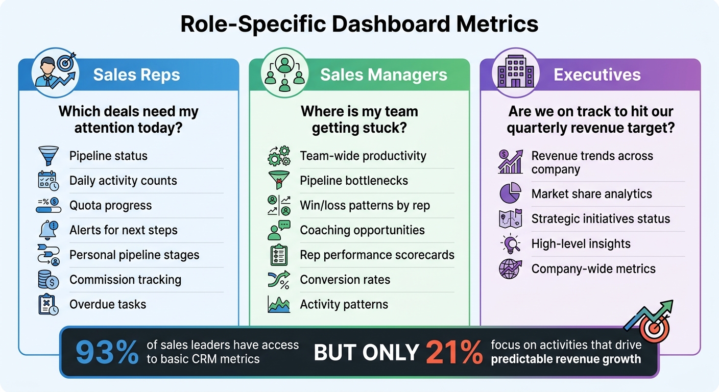
Role-Specific CRM Dashboard Metrics for Sales Teams
One of the biggest mistakes in dashboard design is focusing on the data you already have instead of the decisions your team needs to make. The key to creating effective dashboards is understanding the unique needs of your team members. Start by identifying the questions each role needs to answer regularly. For instance, a sales rep might wonder, "Which deals need my attention today?" A manager might ask, "Where is my team getting stuck?" Meanwhile, an executive is likely focused on, "Are we on track to hit our quarterly revenue target?"
Define Key User Roles
Each role within your team requires different metrics to perform effectively:
- Sales reps need to see their pipeline status, daily activity counts, quota progress, and alerts for next steps.
- Sales managers focus on team-wide productivity, identifying pipeline bottlenecks, understanding win/loss patterns by rep, and spotting coaching opportunities.
- Executives require high-level insights, such as revenue trends across the company, market share analytics, and the status of strategic initiatives.
The numbers tell a clear story: while 93% of sales leaders have access to basic CRM metrics, only 21% focus on the activities that drive predictable revenue growth. This disconnect happens because dashboards often try to display everything, rather than highlighting what truly matters for each role. Tailoring metrics to specific responsibilities helps cut through the noise and reduces information overload.
Once you’ve identified role-specific needs, the next step is to align dashboard features with the goals of each user.
Match Dashboard Features to User Goals
Every dashboard element should directly support what the user needs to achieve. For example:
- A sales rep aiming to hit their quota needs a dashboard that emphasizes personal pipeline stages, commission tracking, and overdue tasks – not broad company analytics they can’t act on.
- A manager focused on coaching their team benefits from scorecards that highlight rep performance, conversion rates, and activity patterns.
This role-specific focus not only makes day-to-day tasks more efficient but also ensures that users can stay informed on the go. Mobile access plays a critical role here – teams using mobile CRM tools hit their sales targets 65% of the time, compared to just 22% for teams without mobile access.
To determine the most important metrics, ask, "Which metric, if it changed suddenly, would have the biggest impact?". The answers to this question help zero in on the data that drives decisions and ensures your dashboards are actionable, helping to minimize revenue loss through better focus and discipline.
Select the Right Metrics and KPIs
A good dashboard simplifies decision-making by focusing on actionable metrics. If a number doesn’t lead to a clear next step, it’s just clutter. Your dashboard should cut down analysis time and help you identify stalled deals, prioritize revenue-generating activities, and address urgent tasks quickly.
Core KPIs Every Sales Dashboard Needs
Start with metrics that directly affect revenue. Sales revenue measures the total value of closed deals within a specific timeframe, offering a snapshot of past performance. Sales forecast predicts future revenue by multiplying deal values by their likelihood of closing, based on pipeline stages. This keeps your team grounded in what’s probable, not just possible.
Another key metric is the total pipeline, which tracks all active deals with closing dates in your chosen period. To make pipeline data meaningful, pair it with conversion rates – such as the win rate (percentage of closed opportunities) and the lead conversion rate (how efficiently leads turn into opportunities).
Two often-overlooked metrics can provide essential insights: deal age and next-step coverage. Deal age shows how long opportunities stay in each stage, helping you identify deals that are stagnating. Next-step coverage ensures every deal has a clear follow-up plan – deals without next steps risk losing momentum. Use visual indicators like red flags for overdue deals to spot potential revenue risks instantly.
Finally, track activity metrics to gauge your team’s daily efforts. This includes cold calls, successful calls, meetings booked, and new customer acquisitions. These numbers reveal whether your team is putting in the work needed to meet their goals.
When building your dashboard, balance these core KPIs with activity-based metrics for a well-rounded view.
Combine Leading and Lagging Indicators
A strong dashboard blends leading indicators (predictive metrics) and lagging indicators (results-based metrics). Lagging indicators like total revenue, won deals, and quota attainment show what’s already happened. Leading indicators, such as call volume, email outreach, and new leads, highlight behaviors that drive future outcomes and help forecast trends.
The key is connecting these two types of metrics. For example, by identifying which activities consistently lead to closed deals, you can coach your team to focus on the behaviors that yield results. If leading indicators start to dip while lagging indicators remain strong, it may signal that current success won’t last – prompting you to adjust strategies proactively.
Maintaining balance is crucial. Use metrics like the relationship between new leads and total pipeline to decide whether your team should prioritize prospecting or closing existing deals. Monitor pipeline velocity to see how quickly deals progress through stages and identify bottlenecks in your sales process. This mix of past performance and forward-looking data ensures your team can address challenges early and stay on track to meet revenue goals.
Design for Clarity and Easy Navigation
Once you’ve identified the right metrics, the next step is designing a dashboard that transforms raw data into actionable insights. The design should prioritize simplicity and clarity. As Jonny Rowse from CRM Beat explains:
"A useful dashboard is the opposite. It shows a small number of metrics that drive decisions, refreshes automatically, and makes it obvious when something needs attention".
The aim is to create a dashboard that sales reps can quickly scan to identify what requires immediate action and track sales effectively. This involves using layout and visual design principles that align with how people naturally process information, ensuring that critical details stand out.
Layout and Navigation Principles
Start with the top-left corner. People tend to read from top left to bottom right. Place your most critical metric – be it monthly revenue, pipeline value, or new leads – in the top-left corner to grab attention immediately.
Group related metrics together. Organize metrics by category for better readability. For example, keep all lead-generation data in one section and revenue metrics in another. This makes it easier to notice patterns, such as a spike in leads paired with a drop in conversions.
Stick to the one-screen rule. A dashboard should fit on a single screen to avoid unnecessary scrolling. Limit it to five to eight key metrics per view. If there’s too much information, consider you’re tracking too many metrics. Use a top navigation bar for filtering by rep, team, or organization, and keep real-time activity feeds in a sidebar to avoid cluttering the main view.
Maintain consistent timeframes. Ensure all widgets align to the same timeframe, such as "this month" or "last 30 days." Inconsistent timeframes can confuse users and make comparisons difficult.
Visual Design That Improves Usability
Use white space effectively. White space improves readability and prevents the dashboard from becoming overwhelming or, as Rowse puts it, "digital wallpaper" that users ignore.
Match visuals to the data type. Different data types require different visualizations:
- Use large numbers for single values like monthly revenue.
- Use line charts to show trends over time, such as weekly pipeline growth.
- Use bar charts for comparisons, like revenue by team member.
- Avoid pie charts, especially with more than five slices, as they are harder to interpret accurately.
Color-code for quick insights. Colors can instantly convey the health of metrics:
- Dark green for closed deals.
- Light green for forecasts.
- Yellow for stalled deals.
- Red for overdue tasks or past-due opportunities.
Stephanie Trovato from monday.com highlights the value of this approach:
"Color coding adds another layer of insight. Red might show stalled deals, while green indicates healthy progress".
Provide context for every number. Display metrics alongside targets, comparisons to previous periods, or trend arrows. Numbers without context require extra mental effort, slowing down decision-making.
Add Real-Time Data and Usability Features
Make your dashboard more practical by integrating real-time data and dynamic filters, ensuring your team has instant access to actionable insights. Real-time synchronization is a must – it allows everyone to see the latest pipeline status as deals progress, leads enter the system, or tasks fall overdue. This ensures that every metric reflects current sales activity. As Stephanie Trovato from monday.com explains:
"Effective sales teams run on accurate, real-time information. Yet, many organizations still rely on static spreadsheets and delayed reports, creating a gap between what their team is doing and what leadership can see".
With automatic data refreshes, managers can identify bottlenecks and provide timely coaching, addressing issues as they arise rather than waiting for daily or weekly summaries. Mobile-friendly dashboards are equally important, enabling reps to act on opportunities while on the go.
Enable Real-Time Updates and Alerts
Keep data fresh with automatic updates. Jonny Rowse from CRM Beat highlights the importance of this:
"If the dashboard shows yesterday’s numbers and your team knows it, they will stop trusting it. Make sure the data refreshes frequently enough to be useful".
Incorporate live activity feeds to provide instant visibility into new leads, deal progress, calls, and tasks. This reduces the risk of duplicate outreach and keeps everyone on the same page without the need for manual intervention. Adding clear visual indicators helps teams quickly identify priorities without having to sift through every metric.
Provide Filters and Custom Views
Offer multi-level filtering to allow users to switch between their individual pipeline, team performance, or company-wide metrics. Sales reps need a clear view of their quotas and next steps, managers require insights into team productivity, and executives focus on high-level revenue trends and strategy. Adding time-period dropdowns lets users quickly analyze monthly, quarterly, or annual progress.
Implement role-based access controls to customize the data each user sees. Steve Chipman from CRM Switch underscores this flexibility:
"Not every CRM dashboard component is needed by every employee, and most enterprise CRM solutions are flexible enough to let each user (with appropriate permissions) choose which components to view".
Filters for region, product line, or deal owner help users focus on the most relevant data, reducing distractions and improving productivity. When dashboards are tailored to individual roles and responsibilities, they become tools that genuinely support daily work instead of creating extra tasks. These personalized views ensure your team gets the most out of their dashboard, boosting both efficiency and engagement.
Build Better Dashboards with Teamgate CRM
Teamgate CRM focuses on disciplined selling, pipeline transparency, and ease of use. Its dashboard design ensures that every feature supports predictable revenue by addressing common sales challenges: undefined next steps, inconsistent follow-ups, and unreliable forecasts. This approach minimizes revenue leaks while helping teams stay on track.
Use Teamgate’s Visual Deal Pipeline
Teamgate’s visual pipeline is built around a drag-and-drop Kanban-style board, offering a clear overview of deals. Each deal card displays key details: the current stage, assigned rep, deal value in USD, next step due date (formatted as MM/DD/YYYY), and activity history. This layout ensures deals keep moving forward. Overdue next steps are flagged in red, and aging opportunities are automatically highlighted, helping managers act before deals go cold.
Here’s a real-world example: In Q1 2024, LeadGenius, a SaaS company based in the UK, adopted Teamgate’s visual pipeline. Within three months, their stale deals dropped by 35%, going from 22% to 14% of their total pipeline. By restructuring their sales stages with mandatory next steps and dashboard alerts, they achieved 92% pipeline accuracy and generated $450,000 in predictable revenue. Sales Director Mark Thompson credits these changes for the improvement.
Teamgate also supports accurate forecasting. By multiplying deal value by the win probability of each stage, it calculates forecasts while excluding overdue deals to maintain realistic projections. Andrew Martin from Teamgate CRM advises:
"Too many stages won’t help your sales reps to act quickly and properly. Therefore, it would be an excellent idea to have three to five stages".
These visual tools integrate seamlessly with automated workflows, simplifying follow-up tasks.
Automate Follow-Up with Built-in Workflows
Teamgate’s workflows take the guesswork out of follow-ups by automatically generating tasks and reminders when deals move through stages. For instance, when a deal shifts to "Proposal Sent", the system creates a 3-day follow-up email task and adds a calendar reminder adjusted for US time zones. If no activity occurs within seven days, dashboard alerts notify both reps and managers.
The platform centralizes all sales activities – emails, calls, meetings, and notes – within the deal view. This means reps only log their work once, and the CRM updates automatically. Admin time is significantly reduced, with features like one-click task completion and custom filters such as "My Overdues" or "Team at Risk" keeping reps focused on selling rather than data entry.
Drive Adoption Through Simple Design
Teamgate prioritizes simplicity with a rep-first dashboard design. The interface is clean and single-paged, requiring only essential fields like stage, next step, and deal value in USD. CRM implementation takes less than an hour, and the platform auto-populates activity from emails and calls without needing manual tagging. By avoiding mandatory custom fields, Teamgate ensures reps update the CRM because it delivers actionable insights – not because they’re forced to.
The dashboard highlights critical sales metrics, forecasts, and top opportunities, while allowing users to customize their activity feed. This keeps the interface uncluttered and focused. Andrew Martin from Teamgate CRM explains:
"The new dashboard has been created with a sales professionals advisers and clients demand in order to purify the key indicators in daily sales team life".
For managers, leader dashboards provide insights into leading indicators such as deal age distribution, activity velocity (e.g., calls and emails per deal), and next-step coverage percentages. Managers can drill down to individual rep performance, spotting neglected high-value deals – for example, opportunities worth $50,000+ that haven’t been updated in weeks. This evidence-based visibility enables managers to coach effectively, relying on clear data rather than assumptions.
Jack Hodges, Sales Manager at FiveCRM, shared his experience:
"With Teamgate’s intuitive interface, our user adoption was immediate. Even with a remote team… we were onboarded and up and running within hours".
Teamgate’s design and functionality have earned it recognition as Capterra’s #1 "Value-for-Money" CRM for 2024. It holds a 4.7/5 rating on G2 from over 250 reviews, with users frequently highlighting its intuitive pipelines and automation features that save time. The platform boasts a 95% user adoption rate, thanks to its low administrative burden and focus on helping sales teams close deals rather than manage data.
Conclusion
Creating a CRM dashboard that genuinely supports your sales team boils down to three essentials: aligning with user needs, focusing on actionable metrics, and ensuring accurate, real-time data. Dashboards shouldn’t just display numbers – they should guide decisions. A well-crafted dashboard helps reps identify their next steps and prioritize key deals, while giving managers a clear view of deal progress, activity levels, and pipeline health. As Jonny Rowse from CRM Beat aptly states:
"The best dashboards look almost too simple".
The focus should be on metrics that prompt action, such as identifying stalled deals, overdue tasks, or sudden drops in lead volume. Real-time updates and intuitive visual cues, like traffic-light signals, make it easy to spot and address issues immediately.
By incorporating these strategies, your dashboard becomes a tool for smarter decision-making. Teamgate CRM embodies these principles by promoting disciplined selling – ensuring no deal is left without a next step, flagging aging opportunities before they expire, and excluding overdue deals from forecasts to maintain accuracy. Its visual pipeline management, automated workflows, and user-focused design encourage adoption by enhancing the sales process instead of adding unnecessary tasks.
To maximize the impact of your dashboard, set it as the default home screen and incorporate it into weekly team reviews to establish consistent habits. Reevaluate your metrics regularly – perhaps quarterly – to remove widgets that no longer provide value. When your dashboard becomes the single source of truth, forecasting evolves from guesswork into data-driven planning, making revenue outcomes more predictable.
FAQs
How do I choose the right 5–8 dashboard metrics?
To choose 5–8 meaningful dashboard metrics, start by identifying the crucial decisions your sales team faces each week. Pick metrics that make those decisions easier, spotlight pressing concerns, and directly align with sales activities. Examples include tracking upcoming meetings, overdue tasks, deals nearing close, or aging deals. Keep the dashboard clear and focused – avoid overwhelming it with excessive data. The goal is to create a tool that’s practical and actionable for daily use.
What should a rep vs manager vs exec dashboard include?
A sales rep’s dashboard should focus on essentials like active deals, upcoming tasks, and clear next steps to keep deals moving forward. Sales managers, on the other hand, need a broader view that includes team metrics such as goals, forecasts, top-performing deals, and activity tracking to assess overall performance. For executives, the priority is high-level insights – pipeline health, forecast reliability, and deal aging – to inform strategic decisions. Custom dashboards help ensure that everyone gets the specific insights they need to excel in their role.
How do I keep CRM dashboard data accurate in real time?
To keep your CRM dashboard accurate and up-to-date, rely on tools that automatically refresh with the latest sales pipeline and team activity data. This removes the hassle of manual updates, ensuring tasks, deals, and team progress stay current. Real-time updates allow your sales team and managers to focus on disciplined selling while maintaining a clear and reliable pipeline.